“The fundamentals of science are you do not tamper with the original evidence. That has happened with our temperature record, where the past has been cooled and it makes it look as if we’re warming. That is fraud.” Ian Plimer
“BOM are right often enough to be considered, but wrong often enough not to be relied upon.” Goff O’Niell’s grandfather
Introduction
Like most Australians growing up in the 70s and 80s, I always viewed large government institutions such as CSIRO and the Bureau of Meteorology (BOM) as well-respected and venerated organisations. BOM kept the official weather data and was relied upon by everyone for weather forecasts. They also played a role in analysing past, not future, climate trends.
However, I and many others, have become increasingly concerned that BOM has allowed itself to become part of the “climate change industry”, and the advice it provides to the government for significant policy decisions is not based on robust, competent science.
As the world celebrates World Meteorological Day later this month, I thought it timely to have a close look at what BOM has been up to for the last 30 years as part of its contribution to understanding the changes in the climate and associated trends.
While meteorologists study weather patterns over days and weeks, I suspect many instead are involved in climate trends over decades or centuries.
Turning a cooling trend into a warming trend
“If you torture the data long enough it will confess to anything” Ronald H. Coase
My alarm at the muddling of data sets by meteorologists to fit a narrative in climate science is not confined to Australia.
In the USA, it has been proven that temperature data has been manipulated to fit a hypothesis. It has been shown that the two custodians of the temperature records intentionally adjusted historic annual temperature records downward to support assertions that dangerous human-caused global warming is occurring.
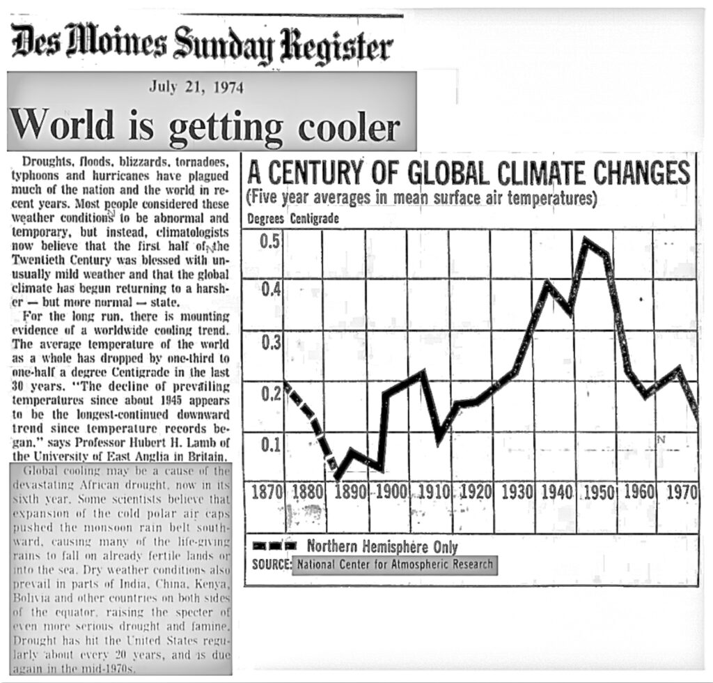
The graph below comes from an article published in the Des Moines Sunday Register on 21 July 1974, using official records. It shows global cooling from 1940 to 1974, as presented by science authorities at the time.
In 1989, the head of the National Oceanic Atmospheric Administration’s (NOAA) National Climatic Data Centre (NCDC), examining the same data, said the Earth cooled from 1921 to 1979, clearly contradicting the data.
However, things changed in 1999 when the global cooling was “adjusted away”, and the official record now shows a warming trend. The National Aeronautics Space Administration’s (NASA) Goddard Institute of Space Studies (GISS) chief James Hansen and colleagues came out with a research paper titled GISS analysis of surface temperature change. It contained a collection of claims to support an impending global warming problem. Hansen included in his paper a graph (original Figure 6 – see below) of the official NASA temperature data for the USA from 1880 to 1999, as it existed at the time.
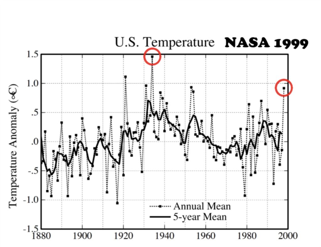
The graph shows via the red circles that 1934 was the warmest year in the time span shown, approximately 0.6OC warmer than 1998. Also, 1921, 1931 and 1953 are warmer. The graph is notable as it shows a strong cooler trend from the 1930s to the end of the century.
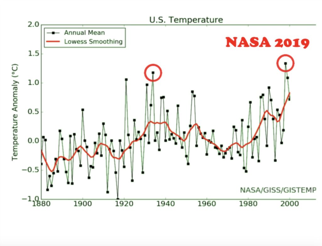
However, in 2011, despite using the same database, NASA now shows a new chart with data through to 2019. See below. This new chart is also now in Hansen et al‘s 1999 paper. The new graph shows 1998 as warmer than 1934 and 1921, 1931 and 1953. All the earlier years are cooler, and the later years are warmer. In essence, the data showing a declining temperature trend from the 1930s to the 1990s is now a warming trend. Remember, this is from the same dataset. Lots and lots of people have noticed this, and have tried to get an explanation, but none is forthcoming. Why? Surely the public deserve an explanation on why raw data has been changed like this.
Even though NASA is trying hard, it is impossible to erase the historical record. Searching old newspaper reports provides an excellent historical account of past weather. For example, 1921 was a hot year around the world. In the USA, newspapers reported terrible heatwaves and drought. The raw temperature US data shows 1921 was the second warmest year on record. However, NASA now records 1921 as one of the coldest years!
American teacher, geologist and electrical engineer Tony Heller, calculated the quantitative alterations in the data for each year. He demonstrated that the changes in temperature data by NOAA near-perfectly match the changing level of CO2 in the atmosphere. Stephen McIntyre, who exposed Michael Mann’s fraudulent hockey stick work, also conducted a similar study.
When Heller’s work exposing data tampering started getting noticed, Fact Checkers jumped in and said his claims were false. While they acknowledged that the data had been altered, they said NASA and NOAA were doing it for a good reason. They quoted a long diatribe from Zeke Hausfather from Berkeley Earth who defined the tampering as making it better. The implication was NASA and NOAA had specific information about the weather stations which forced them to make the past cooler and the present warmer. The odds of that are pretty small. All this shows is Fact Checkers telling us the people doing the tampering are making the data better based entirely on the word of the people doing the tampering. That is the same as holding a trial and letting the defendant determine whether or not they are guilty.
In what can only be described as a comedic and nonsensical tampering of the data, one only has to look at what NASA did altering Iceland’s temperature data.
The climate in Iceland is cyclical where the 1940s were warm and the 1970s were cold, and it has been warm ever since. Iceland’s temperature records closely track the Atlantic Multidecadel Oscillation (AMO) which shows it was very warm in the 1940s and 1870s. The peak of the AMO was 1878.
Despite there being nothing wrong with Iceland’s raw temperature data, NASA made adjustments to that data in 2013 showing a warmer past. But a year or two later, the heat from the 1940s was erased, then in a subsequent year it was back. Then again it was taken away. But in the most recent version of their temperature graph, the heat in the 1940s returned.
In 2012, 49 former NASA scientists and astronauts sent a letter to the NASA administrator admonishing the agency on its climate change stance. They said NASA was putting the reputation of the agency at risk, as well as the reputation of science itself.
If there is nothing wrong with Iceland’s temperature data, why are NASA and NOAA tampering with it? Is it because there are huge amounts of money involved in pretending there is a climate crisis? If NASA told the truth and said there wasn’t a problem with temperatures, they would lose billions of dollars in funding.
There was a scandal in New Zealand in August 2010 when climatologist Jim Salinger was found manipulating New Zealand’s temperature data to show a warming trend. Legal action by the New Zealand Climate Science Education Trust against the government agency led to Salinger’s sacking. His adjusted temperature data that reflected global warming was dismissed as contrary to the correct temperature data that showed New Zealand’s average temperatures had remained steady for a century and a half.
This is what an honest climate scientist from the University of Auckland, now deceased, and hated by the climate science cabal, associate professor Christopher Rhodes de Freitas, had to say about New Zealand’s unadjusted temperature records:
“New Zealand was one of the first countries in the Southern Hemisphere to establish an official nationwide system of weather records. These records provide a rare long time series for temperatures in the Pacific Ocean, informing the data sparse interpolations required for early temperature series. Extant 1868 archives record the national mean surface temperature at 13.1OC (when converted from degrees Fahrenheit) being the average of 10+ years read at six representative weather stations. On the face of it, New Zealand’s long-term temperature has remained relatively stable at 12.6OC over the past 150 years“.
Soon after the Salinger incident, there was another fudging the figures scandal in New Zealand. In 2011, the National Institute of Water and Atmospheric Research Ltd (NIWA) were exposed for lying to the public. NIWA released a reconstructed NZ temperature series in December 2010 with a fresh new graph showing annual temperatures and trends (see below). NIWA claim they used their bible – the methodology from Rhoades and Salinger (1993) Adjustment of temperature and rainfall records for site changes for estimating the effect of known site changes on temperature and rainfall measurements.
But after an independent audit by NZ Climate Science Coalition, it was found NIWA didn’t follow Rhoades & Salinger even though their latest report says they did.
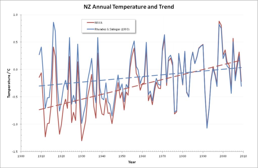
Why is this important? Because it proves that NIWA’s latest review finds warming only by disregarding the statistical techniques it said it would use. The reality is that New Zealand has had no strong warming for the last 150 years, and NIWA lied to the public to try and show otherwise.
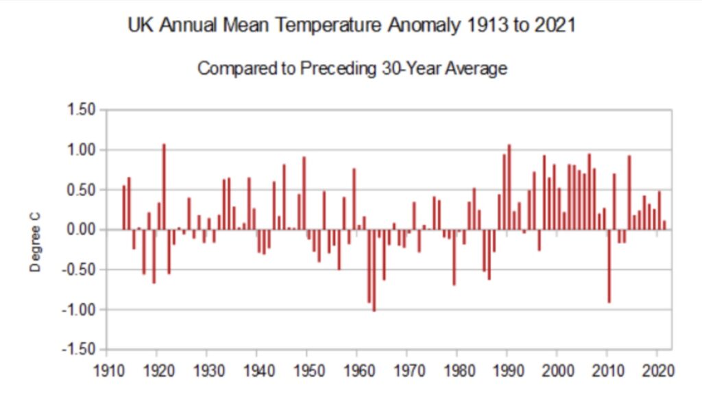
The UK Met Office released a media statement claiming 2022 was the warmest year in the Central England Temperature record, supporting their claim the world continues to get warmer. However, the 10-year average remains virtually the same as in the early 2000s. The “record high” for 2022 is well within the bounds of normal variability. The chart below shows that annual temperatures are frequently around 1OC, either above or below the 30-year average. Last year was 0.8OC warmer than the 30-year average, whilst 2010 was 1.1OC. Both anomalies were the result of weather variability, not climate change.
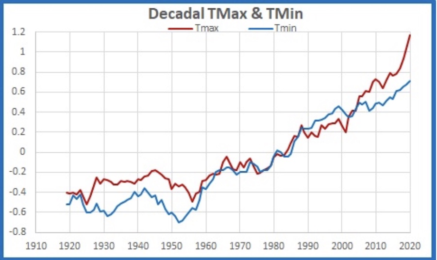
Scientist Jennifer Marohasy has spent the past decade looking at BOM’s homogenisation of raw data and is concerned about the lack of transparency and non-repeatable means they use. In a well-known example, she studied the homogenisation of minimum temperature records at the Rutherglen weather station in Victoria. The official temperature at Rutherglen has been changed so that a cooling trend is now a warming trend (see chart below). Other similar examples exist at Amberley in Queensland and Deniliquin and Bourke in New South Wales.
Marohasy and colleagues have also studied the historic temperature records for Victorian weather stations and found a high degree of synchrony in all the maximum temperature series beginning in 1856 and ending in 2016. It suggests that the original measurements of temperatures are an accurate recording of climate variability and change. They didn’t find a continuous warming trend but warming and cooling cycles, with the warmest periods coinciding with droughts.
What is homogenisation?
“At a loosely determined geographical spot over time, the data instrumentation might have changed, the locations of instruments could be different, there could be more than one source of data, or there could be other changes. The main point is that there are lots of pieces of data that some desire to stitch together to make one whole. Why? Why stitch the data together when it is perfectly useful if it is kept separate? By stitching, you introduce error, and if you aren’t careful to carry that error forward, the end result will be that you are far too certain of yourself. And that condition – unwarranted certainty – is where we find ourselves today“. Dr William Briggs
We have been fortunate in many ways that there is a human cultural legacy of recording the weather each day. How temperature is measured, and the environment where weather stations are located can influence trends.
However, watching videos of senior bureaucrats from BOM at Senate Estimates trying to explain their homogenisation process is excruciating as they get themselves into verbal contortions. Climatologists and meteorologists have written computer programs to compare temperature readings near each other to look for changes in one and “correct” them. They call this homogenisation. It is a process to identify outlier temperature readings and replace them with the average and, presumably, weighted readings of surrounding stations.
BOM tell us that it is:
“The method of analysing and adjusting temperatures to remove the artificial influence of things such as site relocations and upgrades to equipment. The process of homogenisation seeks to answer a very simple question: what would Australia’s long-term temperature trend look like if all observations were recorded at the current sites with the current available technology? Homogenisation means we can compare apples with apples when it comes to temperature trends”.
They argue their homogenisation method has been extensively peer reviewed and found to be among the best in the world, thus giving the community confidence they are providing an accurate estimate of Australia’s actual temperature trend.
BOM has a whole department whose job is to focus on homogenising data. Their job is to amend prior weather records. They invested $77 million to build a supercomputer that makes hundreds of millions of iterations amending previous records. The computer costs $18 million a year to run.
Bear in mind, that after recent tragedies such the 2022 South-East Queensland Floods in 2022 and the 2023 Queensland bushfires, BOM and their supporters were screaming poor and their inability to provide real time weather data to affected communities that rely on them. My blog about the 2022 Northern New South Wales floods goes more into detail about this.
It just so happens that the records the computer produces as part of the homogenisation process are adjusted downwards, showing a perceived increase in temperature than the raw data show. It should be noted, that a temperature record which keeps on changing the past hardly can qualify as being correct.
One wonders why outliers in a data set should be deleted or replaced unless BOM can demonstrate a measurement error and the cause can be identified and quantified. Alternatively, it has been recommended that data is deleted or replaced if the apparent outlier is more than two or three standard deviations from the mean, even if the source of the error is not identified.
I am not sure when dealing with temperatures, which vary with elevation, transient cloud cover, windiness, local rainstorms, position of cold fronts, etc., meteorologists do not recognise the risks removing data does to the calculated mean. It is generally acknowledged that there are unique microclimates around Earth. They are more likely to be outliers. Thus, homogenisation suppresses the contribution from these areas.
I also wonder if homogenisation is a process in which everything is averaged to present a single number for national or global temperature. If so, wouldn’t it be better to remove the problem data and not homogenise it?
Because homogenisation is essentially a data-processing practice, it provides an opportunity for mischief. Regardless, the original data should always be archived, which is not happening.
Homogenising the data in Australia
“Homogenisation is a postmodern dance around verifiable facts”. Chris Kenny
Homogenisation of Australian temperature data started in the late 1980s under the watchful eye of BOM scientist Neville Nicholls. Nicholls was heavily involved in the World Meteorological Organisation (WMO) and the then fledgling Intergovernmental Panel on Climate Change (IPCC).
In December 2021, BOM adjusted, remodelled or whatever the correct term is, Australia’s official record for the third time in nine years. BOM maintains a dataset from records at 112 weather stations across the country. It is now 111 stations, as Wittenoom stopped reporting in July 2019 and has been closed.
Platinum resistance probes, as the primary instrument recording official temperatures, are in 105 stations. BOM call the dataset ACORN-SAT an anacronym for Australian Climate Observations Reference Network – Surface Air Temperature. ACORN-SAT is set up to monitor long-term temperature trends in Australia.
As a result of those adjustments, temperatures are warmer than the measured thermometer readings. The latest changes add 0.6OC to maximum warming from 1910-19 to 2010-19 of 1.47OC ± 0.24OC. When they rewrote the ACORN Version 1 dataset from 2011 to 2018, Australia’s per decade rate of mean temperature suddenly warmed by 23 per cent. There is a strong suspicion that the homogenisation algorithm adds artificial warming to the temperature records.
We are also seeing BOM changing temperatures in the ACORN-SAT database, not by a small amount. In some cases, temperatures have been adjusted over one degree from the original measurements, removing a cooling trend from 1940 to 1960.
The largest single change in the new ACORN-SAT Version 2 temperature database was a drop of more than 13OC at the town of Wagga on 27 November 1946. Jennifer Marohasy found that on 8th February 1933, the maximum temperature as measured at Albany in Western Australia was 44.8OC. Then, in 2013 it was changed to 51.2OC! Recently it was changed again, this time to 49.5OC.
According to Perth-based researcher and journalist Chris Gilham, the impact of the adjustments was to cool the past and warm the present, not unlike what has happened in the USA. Marohasy has been very vocal in her assessments of the BOM and their homogenisation process. She argues, “it is a way of generating more global warming for the same weather”.
Marohasy has written many articles asking pertinent questions and raising doubts over BOMs manipulation of temperature data, here, here, here, here, here, here, here, here and here.
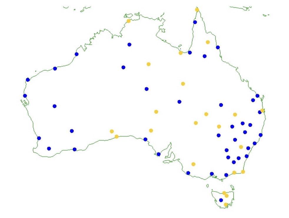
In July 2019, retired school principal and amateur climatologist Ken Stewart started a survey of the 666 weather stations that report temperatures to the BOM’s “Latest Weather Observations” pages for each state to see if they comply with siting specifications. He found less than a third (209) fully complied with siting guidelines outlined in Observation Specification No. 2013.1, drafted in 1997.
He also looked specifically at the 111 weather stations used in the ACORN-SAT dataset. He found that half (49.25 per cent) do not comply with siting guidelines, and less than a third comply with another 20 per cent of marginal status. One would think that an affluent and advanced country like Australia, with its own well-resourced Meteorological Agency, would set a high standard for the siting and reliability of its weather stations. However, that is not the case, with only 209 weather stations fully compliant. It raises doubts about BOM’s modern network coverage and the reliability and comparability of contemporary and historical temperature records.
The map below shows the locations of the compliant (blue) and marginal (yellow) ACORN-SAT weather stations. It indicates considerable gaps in Queensland, Western Australia and South Australia.
Stewart accuses BOM of being incompetent or knowingly allowing inaccurate data to garble the record. For example, there are growing problems with BOMs record for Diurnal Temperature Range (DTR), the difference between maximum and minimum temperatures during the same day. Dr Karl Braganza from BOM said that DTR should decrease as greenhouse gases accumulate.
Stewart looked at the ten-year running means of maximum (Tmax) and minimum (Tmin) temperatures. From 1951 to 2000, DTR behaved with a long-term decrease. After 2000, however, Stewart found Tmax has accelerated in the last 20 years, increasing much faster than Tmin. It is well above the expected values. It is not what is supposed to happen under the greenhouse theory.
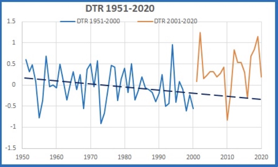
Something happened to Australia’s maximum temperature recording or reporting early this century. Stewart believes BOM changed from using the highest one-minute average of temperatures recorded in AWS to the current highest one-second value for the day, becoming the reported maximum temperature. He believes this is because warmer minimum temperatures at night and in winter are not very scary but record high temperatures and heatwaves make headlines. With the data now showing diurnal temperatures not decreasing as they should, BOM has some serious explaining to do about this contradiction.
Former senior research scientist with Soil Conservation Service in New South Wales, Bill Johnstone, runs a website called BomWatch that provides analyses and reports relating to data quality and homogenisation, metadata and whether previous claims about datasets and their analysis are replicable.
Johnstone strongly argues that weather data was collected to observe and classify local weather, not to measure trends and changes, and this is a significant issue not acknowledged by modern climate scientists who started an “experiment” in the early 1990s trying to detect trends and changes in the climate based on a dataset not fit for purpose. Worryingly, the climate scientists have no input into designing this “experiment”, nor do they know about the instruments and conditions that affect observations.
Johnstone believes climate time series are not amenable to usual statistical analysis, making their studies highly invalid:
“For instance, if data are not free of effects such as site and instrument changes, naïvely determined trend might be spuriously attributed to the climate when in fact it results from inadequate control of the data-generating process: the site may have deteriorated for example or ‘trend’ may be due to construction of a road or building nearby. It is a significant problem that site-change impacts are confounded with the variable of interest (i.e. there are potentially two signals, one overlaid on the other)”.
The reported 1OC temperature increase across Australia in the last century is due to homogenisation. However, the raw data does not show that trend. Also, if the world’s climate is hotter and drier than a century ago, why does BOM not include one of the worst drought periods since European settlement in the official record – the Federation Drought?
Chasing records
BOM has proved shameless in their relentless pursuit of demonstrating a catastrophic warming trend. People need to realise that global averages in climatology are purely statistical constructs.
In 1952, Senior Principal Research Scientist at CSIRO, Len Deacon, published a paper that showed Australia was hotter and drier before 1910. He wrote:
“Australian climatic data show that, for the period 1911-1950, the summer rainfall over much of the southern part of the continent was considerably greater than in the previous 30 years and, for the same season, mean daily maximum temperatures in the interior were appreciably lower.”
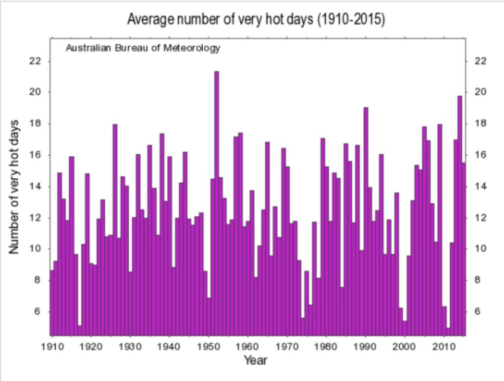
BOM have now hidden data such as Deacon’s from the official record. We know this because BOM now claims that the number of hot days (over 40OC) in Australia is increasing while ignoring temperature data from 1910, showing no overall trend in the average number of hot days.
The data is obtained by averaging all stations with sufficiently long data across the country. The graph below shows the hot days that used to be available on the BOM’s Climate Change page. However, the graph disappeared during the federal election campaign in 2019 because one senses it was just a little too inconvenient during the peak of a major drought, which conflicted with their doomsday messaging.
As the graph shows, there was a peak of very hot days in 1952. While this doesn’t prove CO2 has no effect, the lack of a meaningful trend across the century highlights how misleading it is for the BOM to claim that extreme heat noise proves we need to reduce CO2.
BOM presents the new homogenised data to give the impression it is actual data when it is not. A good example is the changes being made to the Marble Bar weather station records. There have been 13 amendments in the last 100 years. BOM tell us seven of those changes are “statistical”, meaning they don’t have any documentary support. Unfortunately, no one can audit the adjustments, so we do not know their accuracy and whether the changes are designed to meet what BOM tells us about homogenisation.
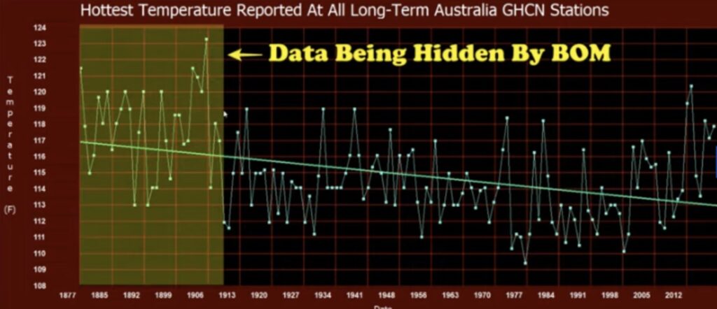
BOM also love to release media statements about broken temperature records. Some of these new records were created by hiding temperature records before 1910.
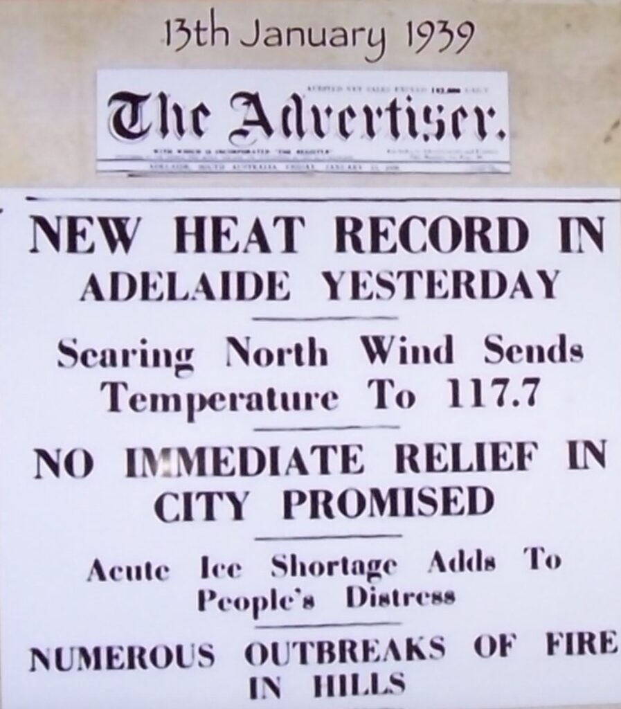
Take, for example, Adelaide. On 24 January 2019, BOM declared a new record maximum of 46.6OC for a capital city, claiming it beat 130 years of records (this is untrue because BOM only accepts data after 1910). BOM claimed the new record eclipsed the previous maximum temperature for Adelaide recorded on 12 January 1939. However, BOM failed to admit that the actual recorded temperature in 1939 was a full degree higher and has been adjusted “down” due to homogenisation. Therefore, recent maximum temperature records only proliferate because BOM has revised downwards earlier readings. BOM claims there are scientific reasons for doing this, but they refuse to be transparent on why they are doing it. There is simply too little scrutiny and transparency about what BOM is doing to adjust the official weather records behind closed doors. Those responsible need to be held accountable as it is becoming too easy to give the impression things are becoming warmer only because of this tampering.
In January 2019, BOM declared the hottest overnight minimum recorded at Doona in New South Wales. But the weather station has only been in place for two years, so all it tells us that this was the hottest night in Doona for two years.
On 30 December 2019, the ABC ran a headline “Hobart weather record falls after 122 years as bushfire takes hold”. BOM forecaster Luke Johnston said the temperature hit 40.8OC at 1:30 pm, breaking the previous record of 40.6OC in 1897. When reporting this to the ABC, he said, “there’s still a chance…we could go just a little bit higher”. However, the official weather observations for Hobart that day paint a much different story. The highest recorded temperature from BOM’s records for that day was 39.7OC.
To explain the discrepancy, BOM wrote in response to Jake Weatherall, who obtained data via an FOI request:
“The maximum temperature recorded at Hobart Ellerslie Rd Station (ID 094029) on 30 December 2019 was 40.8ºC at 13:47. This is the maximum one second temperature reading from the temperature probe at the Automatic Weather Station at the site since 9 am, as temperature is measured every second. The 72 hours of observations that you have provided from our web page show temperatures recorded every 30 minutes, as well as some special observations times (known as SPECI). These are the average temperature over the past minute at the observation times. The maximum daily temperature is therefore usually higher than the highest of the temperatures at 30 minute intervals as air temperatures fluctuate between these 30 minute intervals”.
BOM are admitting a disturbing data integrity and credibility problem with the new equipment used to measure temperatures. A temperature gauge records a record high from a one second grab, whereas the temperature gauge never recorded any other moment of temperature above 40OC on the day. This new record temperature is outside the standard deviation for all other temperature data posted that day. However, it is still used to represent a temperature record surpassing the one that had stood for 122 years and utilised a mercury thermometer that did not record one-second temperature anomalies.
This is not science nor reliable data. For a start, BOM isn’t following their procedures on this one. Under their reporting procedures, they average the one-second temperature readings over a minute to ensure some equivalence between measurements from mercury thermometers and electronic probes. However, even that is dubious as elsewhere in the world, the standard is to average these one-second readings over five minutes.
Jennifer Marohasy has outlined that the highest one-second spot reading is now recorded as the maximum temperature for that day at the 563 automatic weather stations across the country, and the system of numerically averaging ceased sometime after 2011. It is now highly suspicious that the current system of streaming one-second data from the electronic probes directly to BOM’s software easily generates new record hot days for the same weather because of the increased sensitivity of the measuring equipment and the absence of averaging.
This problem helps explain how Braganza presented data to claim fire seasons are getting hotter, longer and starting earlier by analysing Forest Fire Danger Index readings from 1950 to the Royal Commission on Natural Disasters in 2020 after the 2019-20 wildfires. He used combined data from maximums recorded at 3 pm daily from a mercury thermometer with maximums recorded in a one-second grab from probes at any time in the day since the 1990s. All he has demonstrated is a comparison of apples with oranges to produce bananas and misled the Royal Commission.
If you read my fire stories, you will realise that fire seasons do not show the trend Braganza tried to portray. For example, the 2019-20 fires were not unprecedented. My story on the 1968 fires shows that the 2019-20 fires burnt a similar area, but the 1968 fires started earlier, and October and November were hotter than 2019.
On 13 January 2022, BOM claimed the highest-ever Australian temperature record of 50.7OC was reached at Onslow, a small Western Australian coastal town. It equalled the hottest temperature record in Oodnadatta, South Australia, in January 1960. This is a remarkable reading, considering Onslow is subject to coastal breezes that generally moderate temperatures.
However, back in 1995, BOM recognised the official highest temperature in Western Australia was 50.7OC set at Eucla on 22 January 1906. But the hottest temperature recorded in Australia was Cloncurry, reaching 53.1OC on 16 January 1889. It was hotter in New South Wales when Bourke reached 52.8OC on 17 January 1877; in Victoria, Mildura reached 50.8OC on 6 January 1906.
Thanks to writer and science presenter Lance Pidgeon, his research from early explorers and newspapers shows temperature records equally extreme as this century and sometimes even worse. An examination of weather data from the 1800s is genuinely startling. While his work doesn’t falsify the current theory, it goes a long way to silence the persistent claims event X is unprecedented and unnatural.
In January 1896, a savage blast “like a furnace” stretched across Australia from east to west and lasted for weeks. The heatwave lasted 24 days. The death toll reached 437 people in the eastern states. Newspaper reports here, here, and here showed that Bourke had temperatures approaching 120OF (48.9OC) on three days. Unable to sleep, people in Brewarrina walked the streets at night for hours, the thermometer recording 109OF at midnight, and did not fall below 103°F all night. While the thermometers were not standardised in 1896, it is still an example of extreme weather well before the fad of claiming weather today is extreme to support the persistent hype around a climate emergency.
A recent comparison is Victoria’s heatwave in 2009, sold as the worst heat wave in southern Australia for 150 years. The Victorian heatwave began on 25 January 2009 and broke on 30 January. Deaths in Victoria were estimated at between 200 – 374. The population of Victoria in 2009 was about five million, nearly four times larger than the population of New South Wales at the turn of the previous century. Death rates are not a good indicator to compare the severity of heatwaves, as deaths in 1896 would have been less if air conditioners and modern hospitals had been available then.
Bourke used to get a lot of days higher than 49OC before 1906. Hiding data before 1910 conveniently erases Australia’s hot past. It makes it easier for BOM and the media to frighten the public about the future. The reality is that 2022 was one of the coldest years in the last decade, with so much rain that no parts of the country were in drought. However, this reality embarrasses BOM because the head of climate analysis, David Jones, predicted in 2008 that “the drought may never break” and south-eastern Australia would be in permanent drought. “Perhaps we should call it our new climate”, he said at the time. When BOM can’t predict the future and can’t explain the past, they simply erase it from our records.
Tony Heller does a great job of finding newspaper reports that confirm temperatures before 1950 were as hot or hotter than today. Temperature reconstructions from India show plenty of heat in the 19th century.
After announcing fake temperature records, BOM stated:
“Unfortunately, this extreme heat is becoming more common as the world heats up. The number of days over 50 OC has doubled since the 1980s. These dangerous temperatures are now being recorded more often…this poses real threats to the health of people enduring them”.
However, data shows the death rates from natural disasters, including extreme temperatures, are down 95 per cent over the last century. Death rates from droughts were extremely high in the 1920s. There was an unprecedented heat wave and drought in 1921, which put millions of lives at risk. Claiming the climate is more extreme today means either people don’t know history or are being deliberately misinformed. The way BOM is manipulating the temperature narrative is a reminder of George Orwell’s seminal book, “1984”, where he wrote:
“Who controls the past controls the future. Who controls the present controls the past”.
The question I ponder is, why does raw temperature data need to be adjusted anyway?
The homogenisation process must follow the scientific method to claim it is scientific. In this case, when a theory or hypothesis is put forward, the theory needs to be compared to available data. If the theory does not fit the data, the theory must be adjusted. However, for government-employed meteorologists and climatologists worldwide, the narrative never changes. Instead, the data is manipulated or “homogenised” to fit the narrative of a warming climate.
Another problem with the homogenisation process is using phantom stations, particularly in the USA. In the 1800s, weather stations were few and far between. In 1895, 63 per cent of the USA temperatures were estimated because measured temperatures were unavailable. By 1960, only 8 per cent of the USA required estimates. Unfortunately, that did not last as 60 per cent of the USA is again subject to estimated temperatures. That leaves a lot of room for fraudulent biases to creep in. It is incredulous that this level of estimation is occurring when climatologists have access to accurate global temperatures through satellite and weather balloon (radiosonde) datasets. So why do climate scientists insist on just reporting homogenised surface data? It has been suggested that satellite and radiosonde data are more challenging to manipulate.
There is no doubt some past records are inaccurate, but it is impossible to know which ones they are. BOM argues that, over time, temperature records from individual weather stations often show abrupt changes due to local factors that have nothing to do with global or national trends. They are mainly associated with changes in the weather station’s location, changes in the types of thermometers used and the growth of urban heat islands near or around weather stations.
And yet, BOM never concede that the new electronic probes that record instantaneous highs and lows are not affected by very short immediate events such as odd little wind shifts blowing a stream of uncharacteristic hot air from a nearby pavement or parking lot over the sensor for up to a minute; a jet exhaust passing a station nearby at an airport; or a building reflecting heat to the weather station at a certain time of the day.
I would have thought that the reason for homogenisation was to gather data to assess changes that might affect each station’s temperature reporting and then determine a constant figure for how much that change affects the results and then use that continuous amount to adjust the reporting going forward. It appears that doesn’t happen at all.
A peer reviewed paper published in February 2022 looked at adjusted and unadjusted data collected by the National Centers for Environmental Information (NCEI) over ten years from every weather station in Europe (close to 4,000 in total). They concluded the methods used routinely to adjust raw temperature data are flawed and introduce systemic bias in the reported adjusted temperatures.
The researchers tried to reverse the adjustments to see if the homogenisation process validly identified weather station discontinuities, such as location or instrument changes, and made valid adjustments. However, the researchers found that NCEI did not attempt to collect station metadata on such things as moves or instrument changes. Instead, NCEI relies on a supercomputer program, just like BOM, that supposedly picks up discontinuities. The program then identifies different “breakpoints” and applies a homogenisation adjustment. There is no way of linking the adjustments to any particular attribute of the station simply because the program is run every day, different “breakpoints” are identified, and further homogenisation adjustments are made.
It makes no sense that adjustments are repeatedly made to past records just because a new day’s temperature is added. But that is precisely what happens. The meteorologists and/or climatologists controlling the process can easily hide any errors in how the previous adjustment was made, preventing any worthwhile audit.
The authors of the 2022 paper believe the algorithm is “wildly successful” in generating a world temperature time series in the “hockey stick form to support the desired narrative of climate alarm”. They were deeply concerned and found:
“These bizarre inconsistencies in this widely-used climate dataset are scientifically troubling”.
In a Senate Estimates hearing in 2022, a BOM bureaucrat revealed their supercomputer runs 350 to 400 million calculations to the maximum temperature and 250 to 300 million calculations to the minimum temperature at each weather station to derive a transfer function that is used to determine what they think the temperature should have been. Seriously, why so many? Also, no parallel runs, which is a peer standard, are carried out.
Of course, these calculations are based on assumptions that are part of an algorithm that is impossible to audit for accuracy due to its complexity. As someone exposed to the more standard scientific method, I humbly suggest BOM report uncertainty in the temperature records by stating a margin of error for a given confidence interval. It is usually 95 per cent of the sample size, two standard deviations from the mean. That would use much less energy, obfuscation and money than a supercomputer running millions of iterations daily.
The homogenisation process used by BOM is so complex and difficult to understand, which is probably deliberate because what is the justification for running a program each day to produce millions of breakpoints that continually differ? To me, this process completely undermines any confidence the public has in showing a valid representation of temperature trends over a long period. Constantly churning millions of daily records cannot be scientific, no matter how hard they try to explain the process, particularly when it is non-transparent and non-repeatable.
It scares me that meteorological/climatologist bureaucrats can “adjust” the data based on a program they have written. Not that they care, but it leaves them open to the valid conclusion that they can get the desired result. How can we expect any reliability associated with the trends produced from the data once it has been manipulated or homogenised. The fact that the methodology is so obscure and independent researchers cannot make head or tail of their work should be ringing alarm bells worldwide.
Take this example. BOM announced 2019 was the hottest year on record since 1910 for Australia. It was the last year of a bad drought, and so it is not in dispute the year was hot. According to Chris Gilham, the 2019 anomalies cited by BOM “are typical of why the validity of the record high national maximum should be questioned”.
The ACORN-SAT maximum anomalies were 1.55OC in 2018 and 2.09OC in 2019, meaning the maximum at the 104 non-urban ACORN-SAT weather stations was 0.54OC hotter in 2019 than in 2018. However, the average maximum at the 104 stations was 26.6OC in 2018 and 26.9OC in 2019. So, this 0.3OC rise became 0.54OC. Similarly, the average minimum difference between the two years was 0.0OC, but it became 0.22OC.
The ACORN-SAT anomalies rarely agree with actual temperatures. Still, if 2019 was considered “the hottest year on record”, we deserve an explanation as to why that is the case because the trends produced from the data once homogenised lack reliability.
Another worry about the data released by BOM about the changing climate is the margin of error they have put to their long-term temperature trend. In 2011, an independent peer review of BOM’s observation practices said the margin of error or tolerance for thermometer measurements over the last 100 years was ± 0.5OC.
However, as I mentioned earlier, BOM says the margin of error for their latest homogenised release of data for national records since 1910 was ± 0.24OC. The problem is that it is highly improbable to reduce a margin of error of ± 0.5OC, averaged over 100 years, down to ± 0.24OC, averaged over 110 years in just 11 years.
Therefore, it is open to anyone to believe BOM are manipulating the temperature data to give the false impression the Earth is warming faster than it is.
Changing weather instrumentation
No doubt, changing equipment to measure weather parameters can potentially create discontinuities, particularly in the temperature record. The world’s meteorological agencies usually have the new equipment recording alongside the old equipment to compare readings to see if they are comparable. It is called parallel data.
Global warming, climate change or the climate emergency, whatever it is called these days, relies on the study of temperature series over a long period to accurately assess climate variability and change.
In the 1990s, there was a fundamental change around the world in the equipment and methods of measuring temperatures. In 1996, BOM began transitioning from measuring temperatures using mercury thermometers to platinum resistance probes connected to data loggers. The mercury thermometer was once the world standard, but probes are supposed to be very reliable in controlled environments. However, the probes must be insulated from other electrical systems, especially in busy places like airports.
The primary concern is whether the electric probes installed in most of the 700 official weather stations record the same temperatures a mercury thermometer would have recorded.
One way to assess this is to record parallel data. BOM have a policy to do this sort of measuring for two years. Still, they don’t like to share the data with the public, especially the amateur meteorologists and other scientists who are doing a public service in trying to unravel and understand precisely what BOM is doing to the official temperature records through homogenisation.
BOM argue they follow the rules specified by the WMO except for not providing parallel data online. Until late May this year, they were the only government weather organisation in the world that took instantaneous readings from probes and used the highest temperature in any 24-hour period as the maximum for the day. That meant new record hot days could easily be generated for the same weather as with Hobart, as I detailed earlier.
The standard procedure used in the rest of the world is to average over five minutes in the one-second samples, using the highest average over five minutes to record the maximum temperature.
A German meteorologist put doubt on the hypothesis of man-made global warming. He compared the side-by-side temperatures recorded by former glass mercury thermometers with the newer electronic thermometers between 1999 and 2007. His 3,144 daily records showed the electronic thermometers recorded a mean difference of +0.93OC higher than the traditional and older thermometers. Differing measured daily temperature values from old thermometers and new sensors between 1999 and 2006 in Germany shows that 0.9OC of their claimed warming may be due to the transition to electronic probes.
After a three-year crusade, Jennifer Marohasy and colleague John Abbot finally got BOM to provide, under a Freedom of Information request, parallel data for the Brisbane Airport weather station. They were initially and falsely told by BOM that the data did not exist. After Abbot took the issue to the Australian Information Commissioner, they also falsely told him the data did not exist. The truth was revealed after taking the matter to the Administrative Appeals Tribunal in Brisbane in February last year. BOM revealed 15 years of parallel recording since the new probes were installed, but they only released three years from 2019-22. Yet another lie from BOM was exposed.
However, the small dataset was enough for Marohasy to run an analysis, which showed that 41 per cent of the time, the electric probe provided a hotter temperature reading than the mercury thermometer and 26 per cent of the time, cooler readings. She found the differences statistically significant using the paired test. She observed a marked discontinuity after December 2019, where the average monthly difference of minus 0.28OC jumped to plus 0.11OC in January 2020. BOM denied this and stated a fault was immediately fixed, and the station was operating within specifications from that time. However, Marohasy found that after January 2020, the difference between the electric probe and mercury thermometer increased to 0.7OC. BOM dismissed Marohasy’s analysis by simply saying, “they find no significant difference between the probe and mercury thermometer”.
How do we know that warming across Australia hasn’t been caused, to some degree, by a move to resistance probes? Chris Gilham has documented an uptick in temperatures after BOM upgraded power supplies in 2012. He shows a 0.3 to 0.5OC increase across 30 per cent of the weather stations.
The discrepancy is significant because BOM keeps making sensational claims of breaking temperature records at its stations while comparing temperatures recorded using probes with historical temperatures recorded using mercury thermometers.
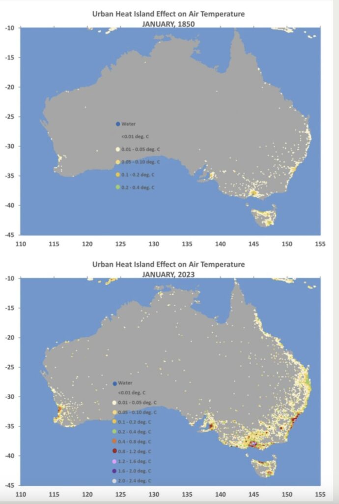
Urban Heat Island effect
Thanks to the work of Doctors John Christy and Roy Spencer, we can see just how much temperature records are influenced by population increase, urbanisation and the build up of infrastructure around the temperature stations from the 1800s to today.
Concluding remarks
In December 2019, BOM famously declared at a meeting with the nation’s agricultural ministers in Moree that there “will be no rain until May”. By mid-February, three states were drenched by a deluge of summer rain. Bushfires were doused, and farmers saw the landscape greening up after a protracted drought period.
At a press conference on 19 September last year, BOM confirmed an El Niño pattern was active over the Pacific Ocean, and there was the development of a positive Indian Ocean Dipole, an important, but little known climate driver. They said the onset of the two major climate events meant the upcoming summer in Australia was likely to be hot and dry, particularly in the eastern states.
While early spring rain was scarce, there were significant falls in parts of the country in November, including on the east coast. Based on their forecast, many farmers sold their stock at low prices fearing they would not have the pasture to feed them.
Then on the 8 December 2023, BOM issued the map below left showing the predicted rainfall up to 2 January 2024. It shows the whole northern tropical coast of Queensland as having a less than 30 per cent chance of exceeding the median rainfall. On that same day, tropical cyclone Jasper, just 450 kilometres off Cairns in the Coral Sea, had just been upgraded to a Category 4 cyclone and was tracking towards the Queensland coast (see map below and centre from BOM tweet on that day).
Most models, including BOM forecasts, predicted a lot of rainfall was expected to hit the coast once the cyclone reached landfall and morphed into a tropical low. BOM even reported that four staff at their remote weather station on Willis Island would be evacuated. Below right is a screen shot of the ACCESS model showing falls up to 600 millimetres were predicted to hit the coast.
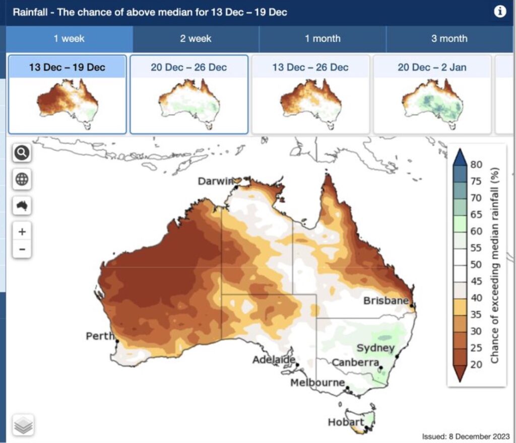
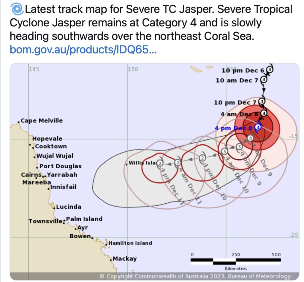
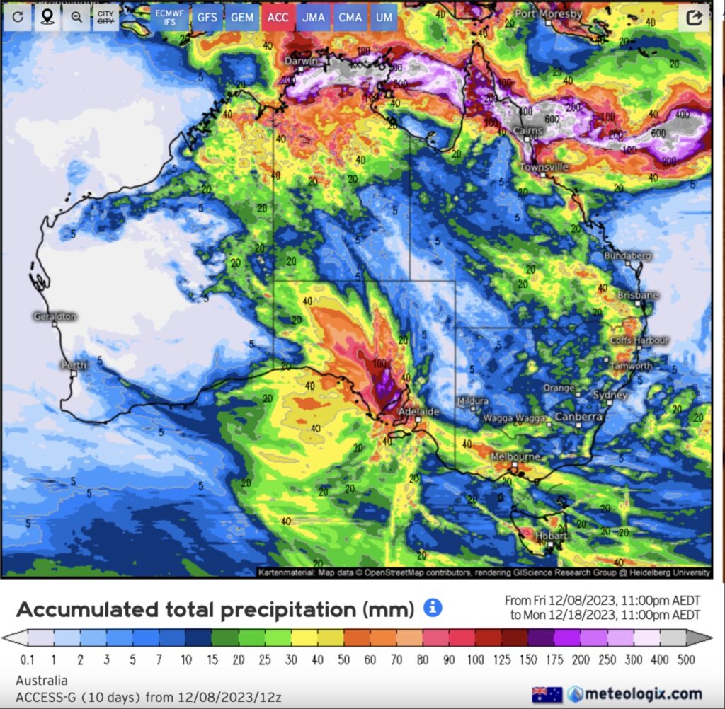
The actual rainfall to hit the coast from the cyclone was in the range of 1,000 millimetres for some areas. The obvious question is, why did BOM forecast below 30 per cent median rainfall for an area their own, and other models, showed was going to be hit by a major cyclone?
In the aftermath of Cyclone Jasper and the Christmas Day storms in South-East Queensland, Australia’s Emergency Management Minister Murray Watt finally broke the government’s silence and acknowledged there is something wrong at BOM headquarters. He ordered a review of weather warning systems after residents at the Cairns suburb of Holloway Beach received major flood warnings hours after they were already isolated by pouring rain. Similarly, residents at Mount Tamborine, first heard of a weather warning after the devastating storms had already passed.
Many have been quick to call this year unusual and directed the blame at the cataclysmic climate change forecasts. Yet, there only unusual thing about this year was the apparent level of incompetence displayed by BOM.
We all use the BOM weather radar link apps and their time lapse rainfall maps to guide us on what is going on and when we can expect to get hit by storms and rainfall. The different colours give an indication of the severity of the precipitation event. However, we rely on BOM to issue weather alerts. Perhaps, during the school holidays, staff monitoring the weather had trouble finding a manager to sign off on issuing the storm alert?
If BOM cannot get a week’s or one, two, three or five-month weather predictions right, how can we trust they know what the weather will be like in 30 to 50 years? Many farmers no longer trust them and have lost faith in their continual inaccurate forecasts. They are turning to paying for weather forecasting services.
I note respected ex-academic Dr Peter Ridd believes the criticism of BOM over their short term forecasts is unfair, particularly as the hardest weather to predict is associated with extreme events such major storms. He argues that the systems associated with these events are “non-linear”:
“When there are large quantities of moisture in the lower levels of the atmosphere, the air need only be lifted slightly to trigger a violent updraft. It is a huge slow-motion explosion where the fuel is the invisible water vapour turning into cloud. The amounts of energy involved can be huge – think Hiroshima atom bomb- and a tiny perturbation can set them off. It is often stated that a butterfly flapping its wings could trigger the storm, at least theoretically. This is one of the least predictable phenomena on earth”.
But he is not so generous of BOM’s performance when it comes to their climate models and long range forecasting.
South Australian cattle farmer, Timothy Burvill, is just one of many farmers that no longer heeds BOM’s forecasts. He chose to hold on to his stock based on a wet November prediction of his new weather provider. He quite rightly pondered:
“How can a small business like that predict the weather more accurately than a massive organisation like the bureau?“
Perhaps the problem is the obsession of BOM in spending millions homogenising raw temperature data via a computer and running models in order to predict a warming Earth 30-50 years into the future, instead of focusing on their core business of collecting and reporting daily weather data and putting their money into better modelling of short term forecasts. Another reason I have read is that BOM rely totally on models supported by the IPCC for their forecasts and ignore current data which can advise them of trends going forward.
These embarrassments occurred less than a year after they couldn’t wait to announce on 7 January 2019 Sydney Basin’s hottest-ever day, basking in their obsession with feeding the climate angst with their “homogenised” temperature records. But with egg all over their faces, they had to quickly retract their media release when they were forced to admit the Basin’s hottest ever day occurred decades ago when carbon dioxide levels were much lower.
So, as the world celebrates World Meteorological Day later this month, perhaps BOM should take time to reflect whether they are an organisation of climatologists or meteorologists. If they are the latter, then they need to stop wasting millions of tax payers funds fudging the figures and focus on their core business of regular forecasts, warnings and monitoring.
It is interesting to note that BOM operates under the authority of the Meteorology Act 1955. The act lists the functions of the bureau, one of which is the:
“…promotion of the advancement of meteorological science, by means of meteorological research and investigation…”
Strictly speaking, meteorological science is the study of atmosphere and motions within the atmosphere on short time scales.
The obvious question I want answered from Minister Watt’s inquiry – where did BOM get the imprimatur to dabble in climatology when the legislation they work under does not allow them to do it?
Rob:
Unfortunately, this is NOT new news! Much the same has been said in print since 1999 when the infamous “HOCKEY-STICK” graph first appeared.
Personally, I do not trust the BOM’s forecasts any further than I can throw them. The only useful information on the BOM website is the radar rain map, which of course is NOT a forecast.
Since the mid-1990’s, I have relied totally on the forecasts found on the US site Weather Underground. There, you can get hour-by-hour information for the next ten days for any place in the world that is near an airport. I have used this website for forecasts in Japan, USA and Europe as well as for Australian places – all with total confidence. I have never been let down!
What an amazing rant – so much nonsense it’s hard to know where to start. This takes the cake for assertions and waffle. We have a bunch of ad homs, sceptic memes, data analysis all in a big slops bucket with weather, seasonal forecasting, and climate change conflated. Now I might even agree with some aspects of what you have opined but little anecdotes and leaving out half the story is pretty average.
So we have the old USA = the world for entree. No attempt to find out what happens if you leave out homogenisation. https://variable-variability.blogspot.com/2015/02/homogenization-adjustments-reduce-global-warming.html
No discussion of what the outcome of the Marohasy affair found. Was a mixed bag. Of course we could ponder melting Arctic, sloppy tundra, methane sink holes, changing tree lines, rapid loss of Antarctic sea ice, most glaciers retreating world wide, changing species phenology as the seasons change (cherry blossoms anyone?), detailed studies on radiation balance. Boreholes. Coral palaeo. And you reckon it’s not warming eh?
Nothing like alternative facts. Do we have a solar driver for warming – nope. Do we understand how CO2 reacts with infrared. Yep.
Hey look Mum – no hands. https://www.youtube.com/watch?v=SeYfl45X1wo&t=20s Black magic.
Or maybe something more sciencey https://agupubs.onlinelibrary.wiley.com/doi/full/10.1029/2005GL023624
The raw data is all there in the BoM ADAM database. Download it – leave out capital city heat islands and roll your own analysis.
That turkey was shot, plucked, cooked, eaten and shat out over a decade ago. Why the furphy has been resurerected is beyong reason.
If you believe Au temps have not risen, and that the records have been tampered with, then give the BOM credit for tampering with all the evidence/temp records all over the world for a century.
https://www.theguardian.com/science/2023/may/07/climate-scientists-first-laughed-at-a-bizarre-campaign-against-the-bom-then-came-the-harassment
You have done a lot of work looking behind the headlines Robert.
Having personal experience with government agencies using pseudo science and using generic information that doesn’t take into account thousands of different micro environments and weather systems, your research is of no surprise.
Interestingly, a local weather station was noticed by the locals over a number of years to report lower rainfall than they recorded.
A resident living under a kilometre away, without any terrain anomalies between, diligently recorded the rainfall for a full calendar year with a simply manual rain gauge. He expected perhaps a 10% viability, given simple measuring equipment used. The difference was over 20% from the official automatic station.
Locals, slightly further away, recorded rainfall for 10 years and had already noticed the anomaly. The high rainfall of the Yarra Valley equates the under recording of rainfall as significant.
This can of course only be considered anecdotal, but when experience has removed all trust, I follow the simple way of evaluating, “facts don’t lie”.